New Music Friday


New Music Friday
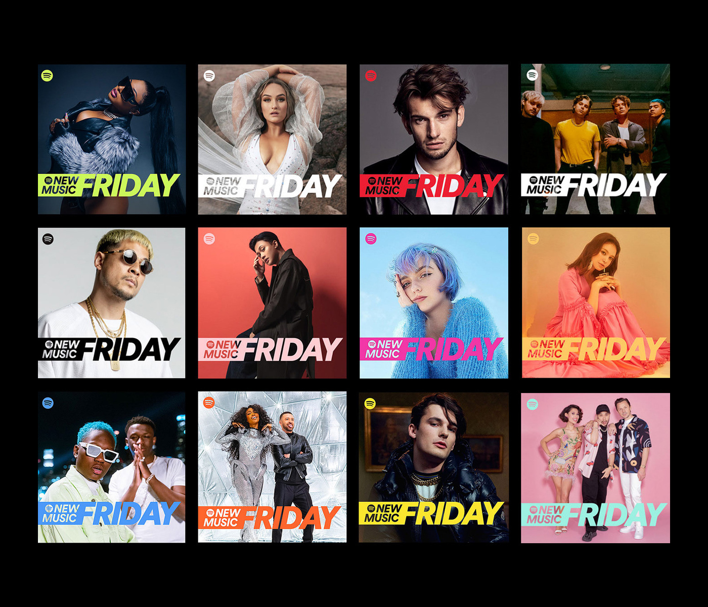
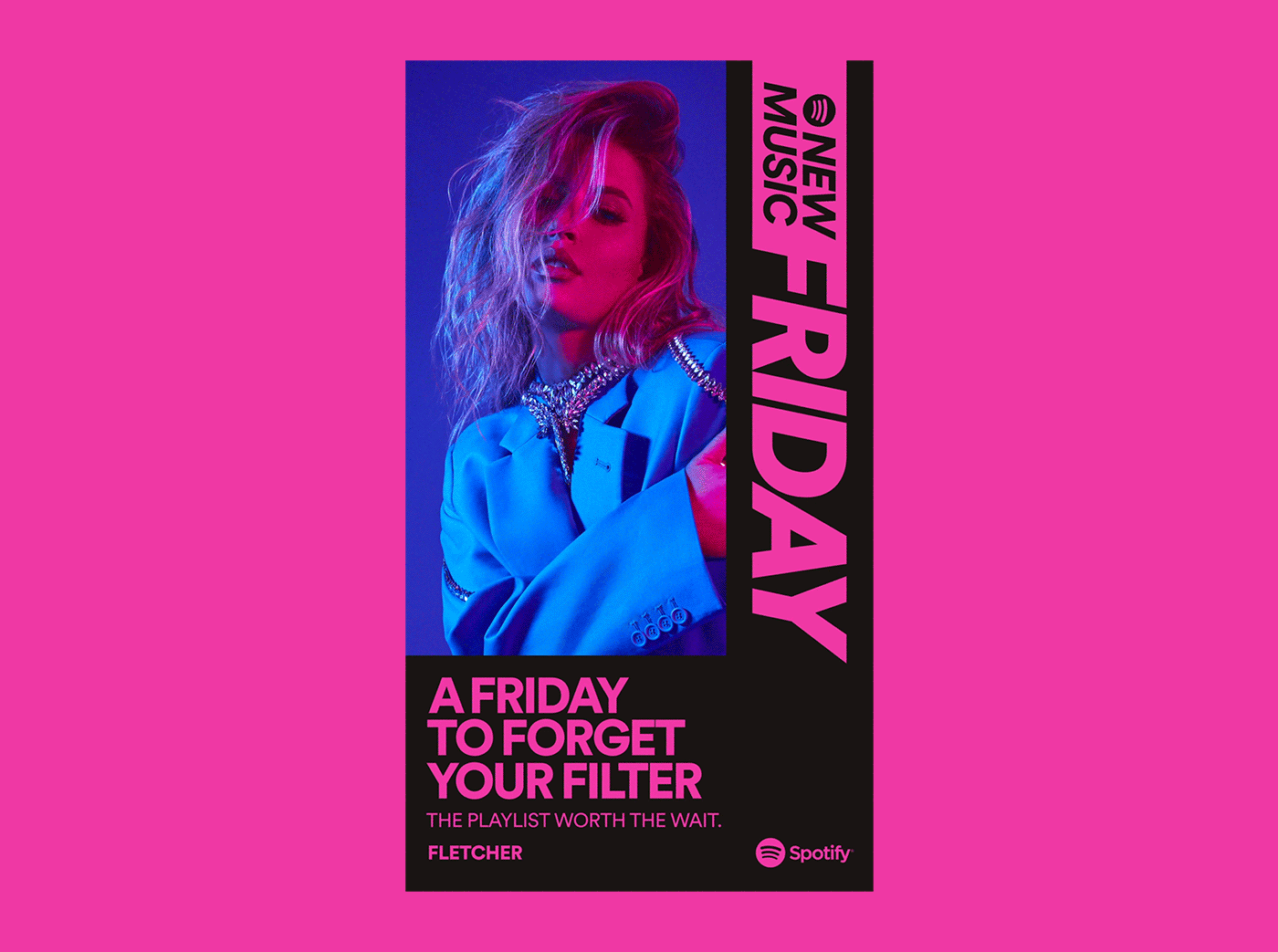
Every Friday, Spotify’s playlist editors curate the latest and most anticipated hits out there to headline the New Music Friday playlists – that you need to listen to, now. To accompany the relaunch of the playlist we proposed a visual identity that builds from the same concept urgency.
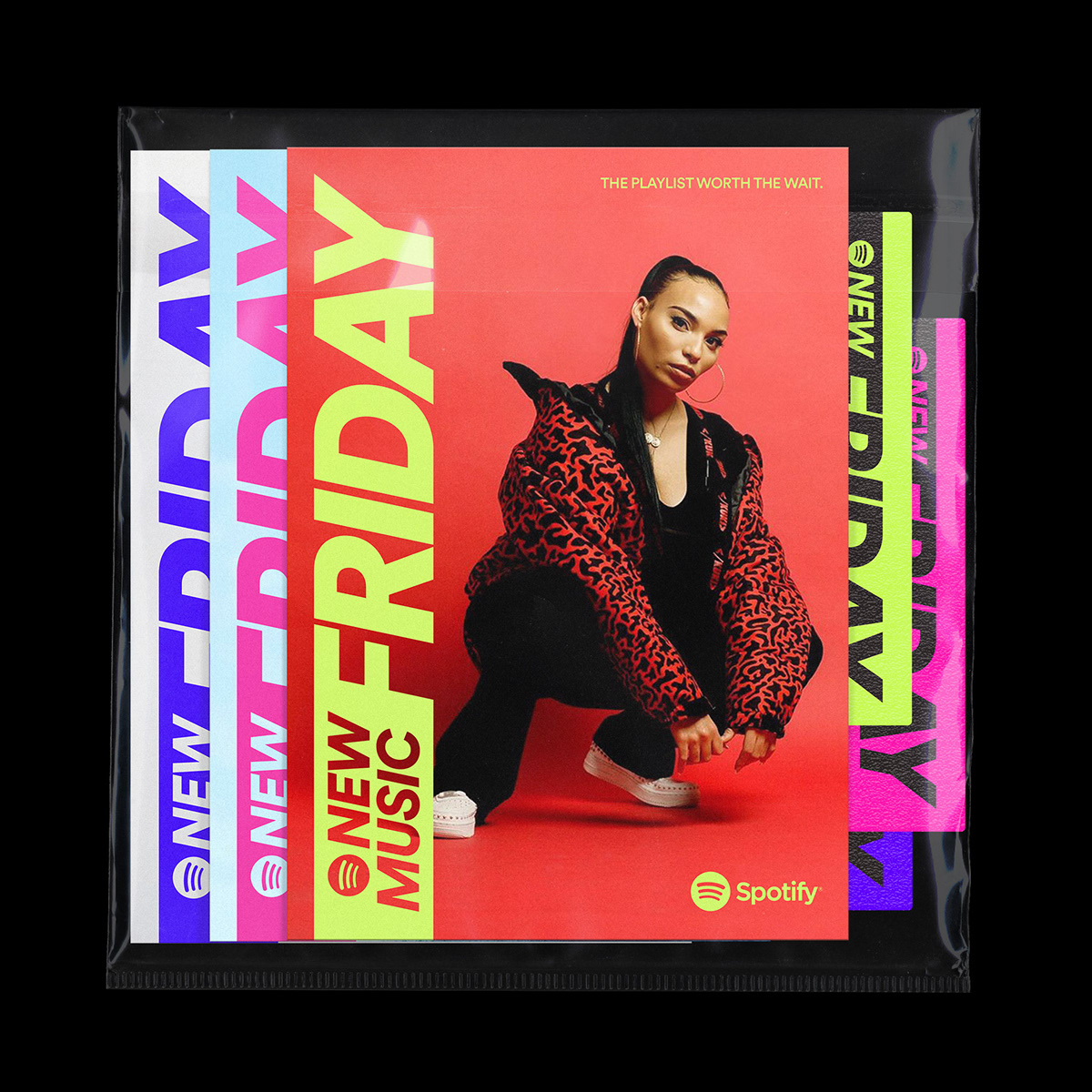
The revamped playlist, which has 43 versions worldwide, will continue to serve as the leading destination for listeners who want to discover new music from both established and emerging talent. With over 3.5 million followers in the U.S. and 8 million globally, it’s an achievement and milestone for artists to have their new tracks included on the list.
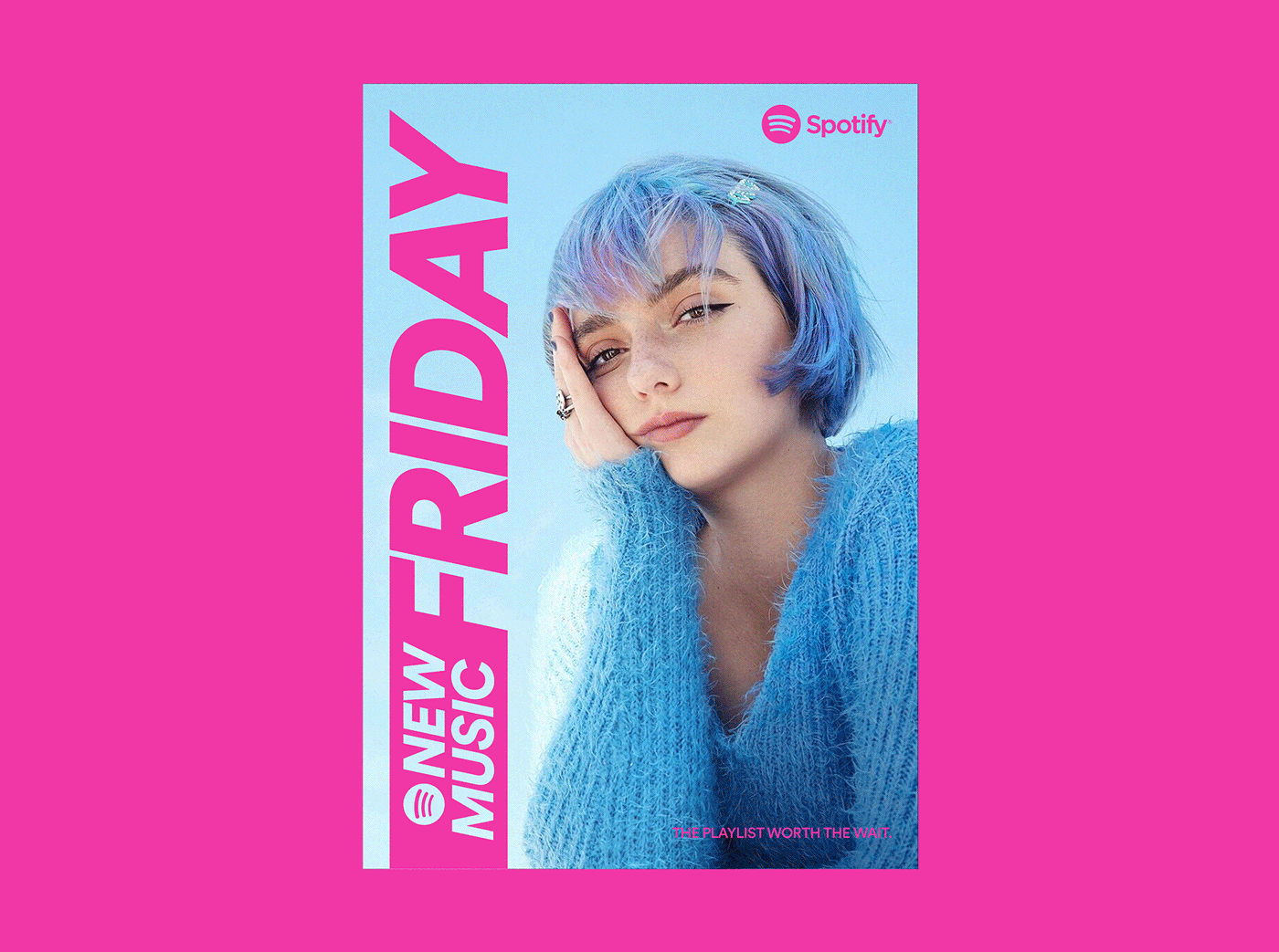
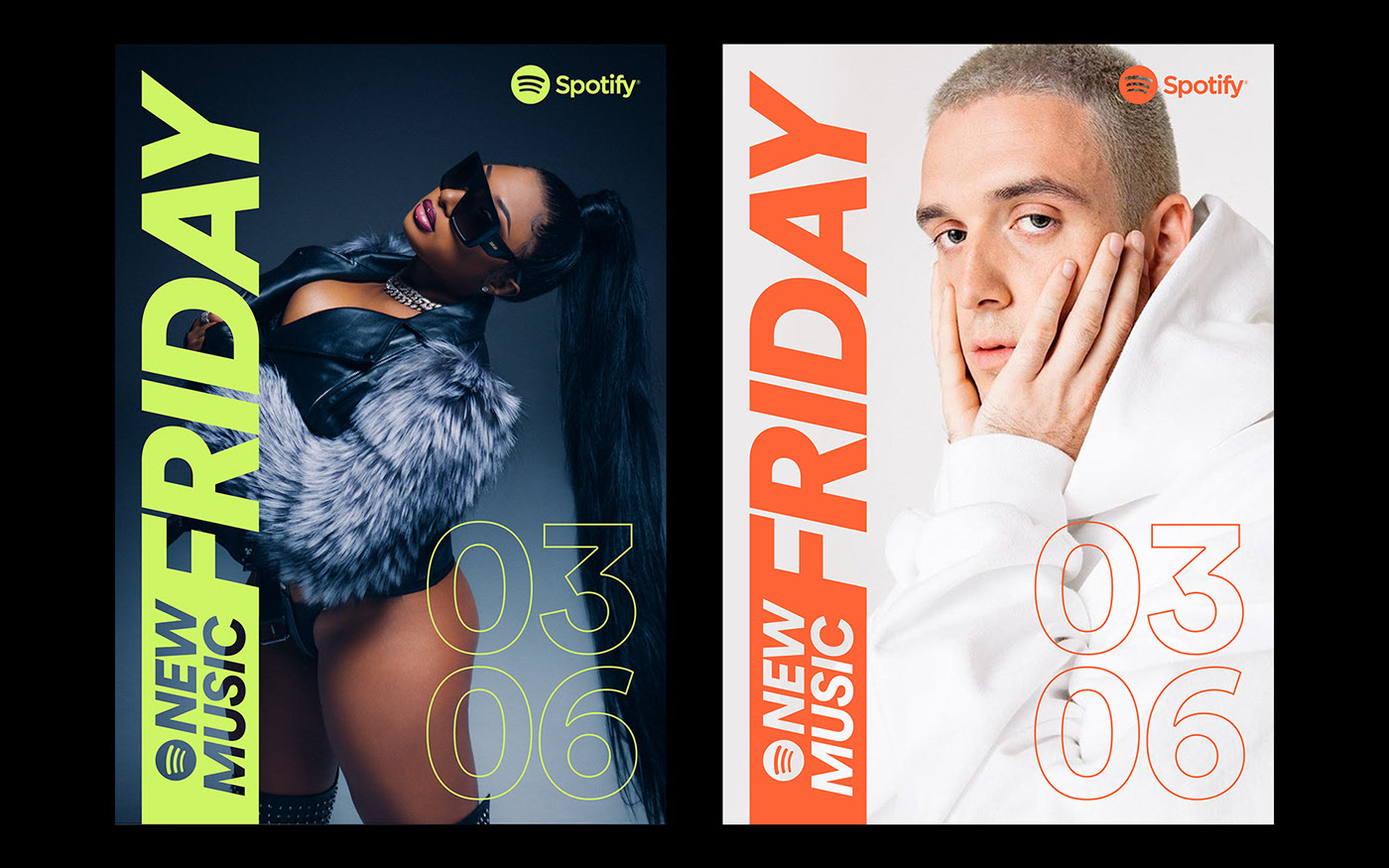
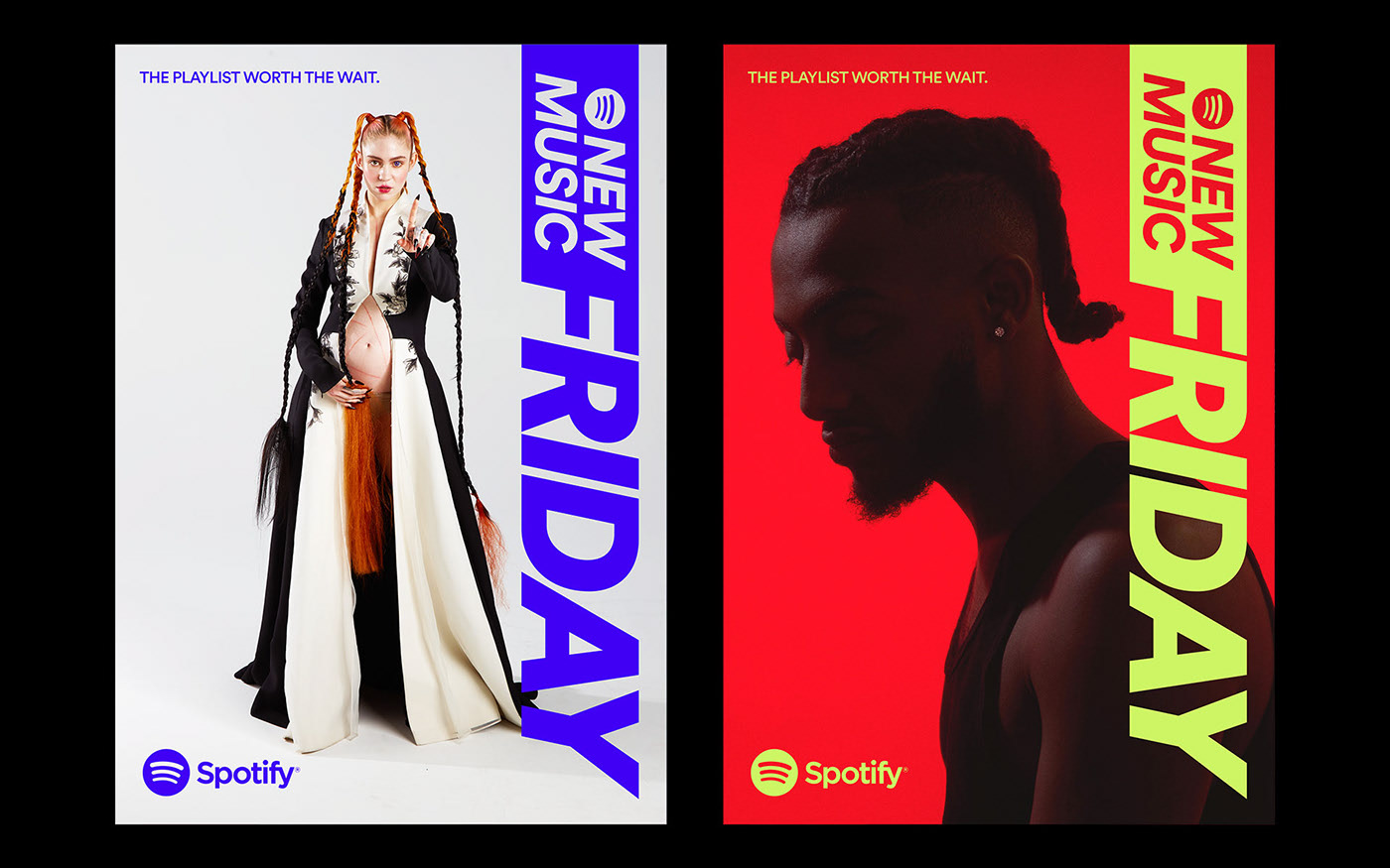
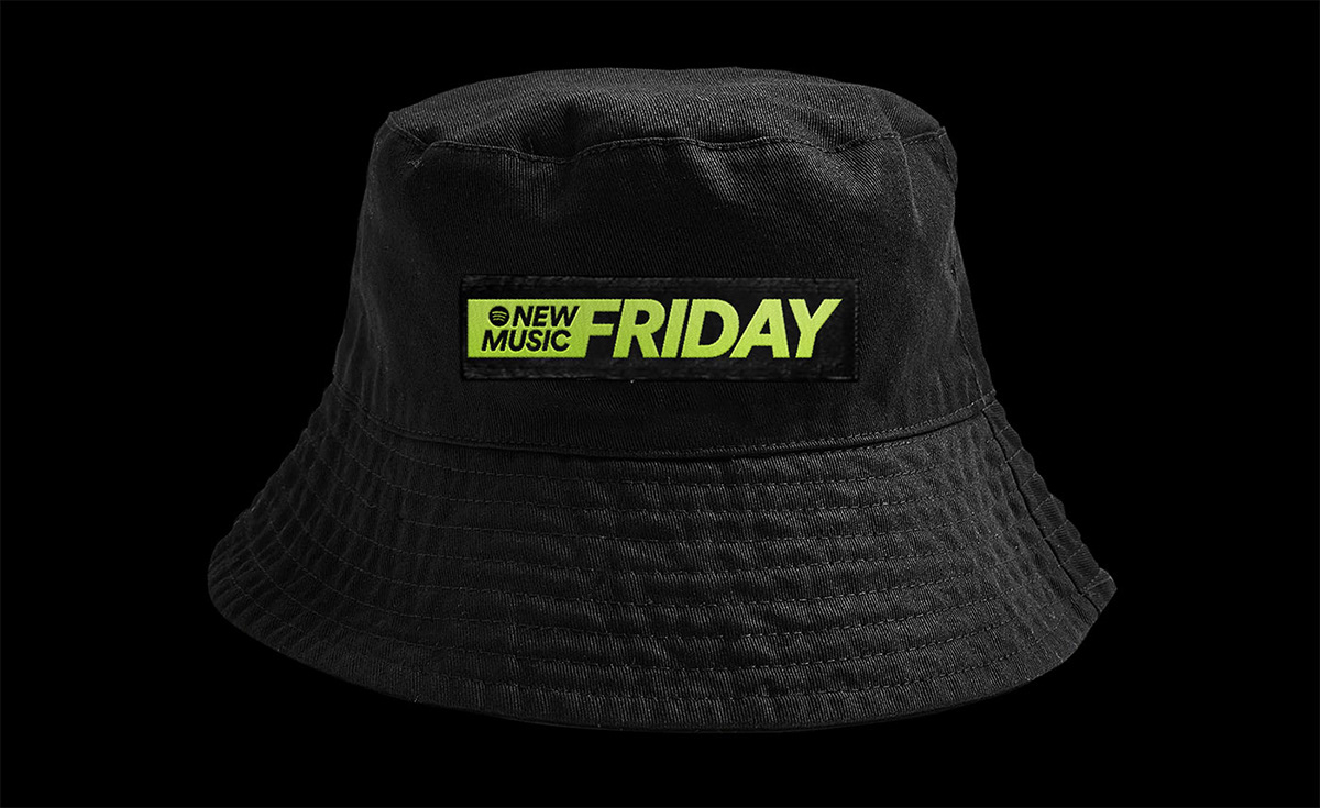
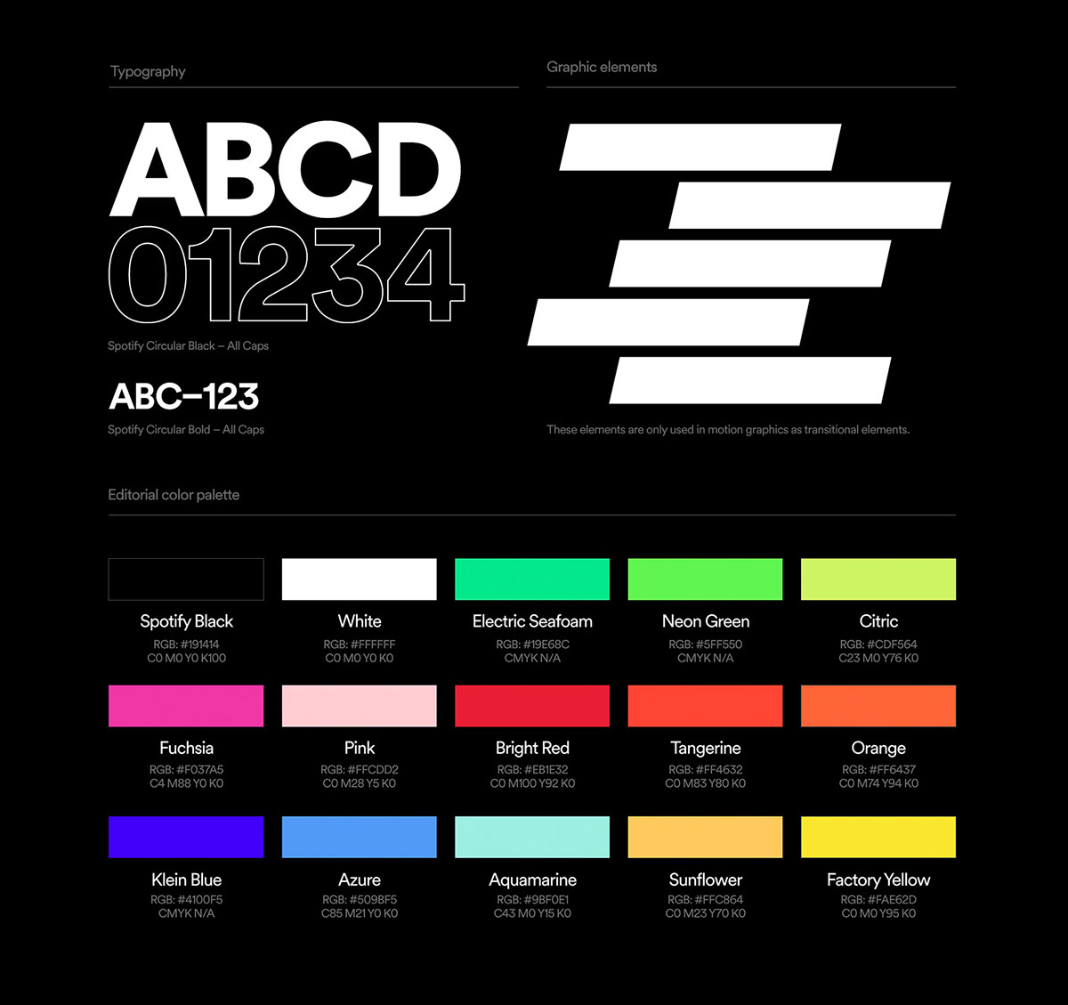
We needed to be bold, fresh and vibrant. For these reasons, we went with the italicized version of Spotify Circular, but made our thickest font-weight, Black, even thicker – and added a tail to visually communicate speed. We developed a motion language that works both as an intro animation and transitions between content. It’s supposed to give a quick glimpse of what you’re about to see, but most of all, set up the stage for what has just arrived. The playlist worth the wait.
Read more on Billboard, Creative Boom, The Brand Identity, Variety, Refinery29 and Forbes.
Every Friday, Spotify’s playlist editors curate the latest and most anticipated hits out there to headline the New Music Friday playlists – that you need to listen to, now. To accompany the relaunch of the playlist we proposed a visual identity that builds from the same concept urgency.
The revamped playlist, which has 43 versions worldwide, will continue to serve as the leading destination for listeners who want to discover new music from both established and emerging talent. With over 3.5 million followers in the U.S. and 8 million globally, it’s an achievement and milestone for artists to have their new tracks included on the list.
We needed to be bold, fresh and vibrant. For these reasons, we went with the italicized version of Spotify Circular, but made our thickest font-weight, Black, even thicker – and added a tail to visually communicate speed. We developed a motion language that works both as an intro animation and transitions between content. It’s supposed to give a quick glimpse of what you’re about to see, but most of all, set up the stage for what has just arrived. The playlist worth the wait.
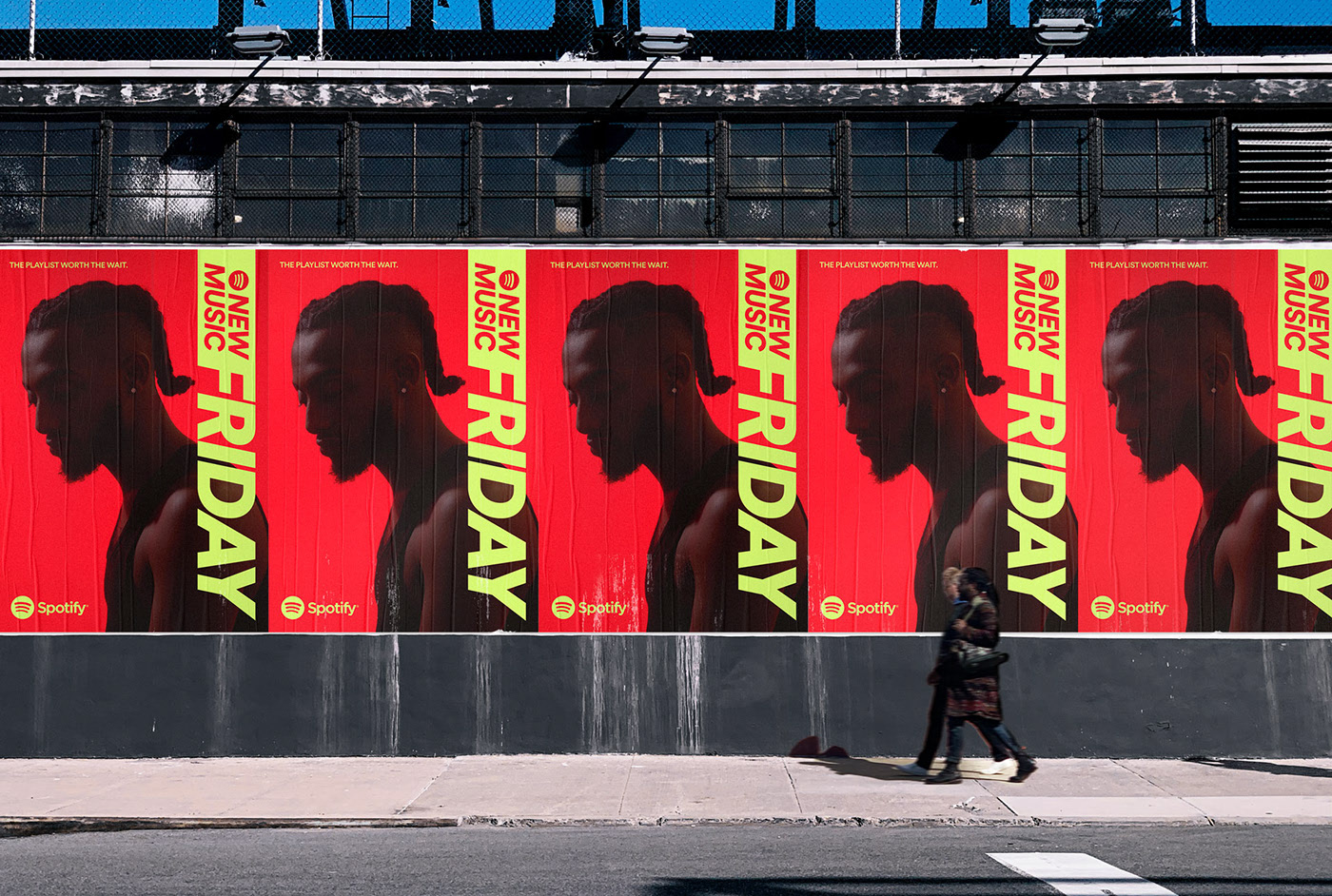
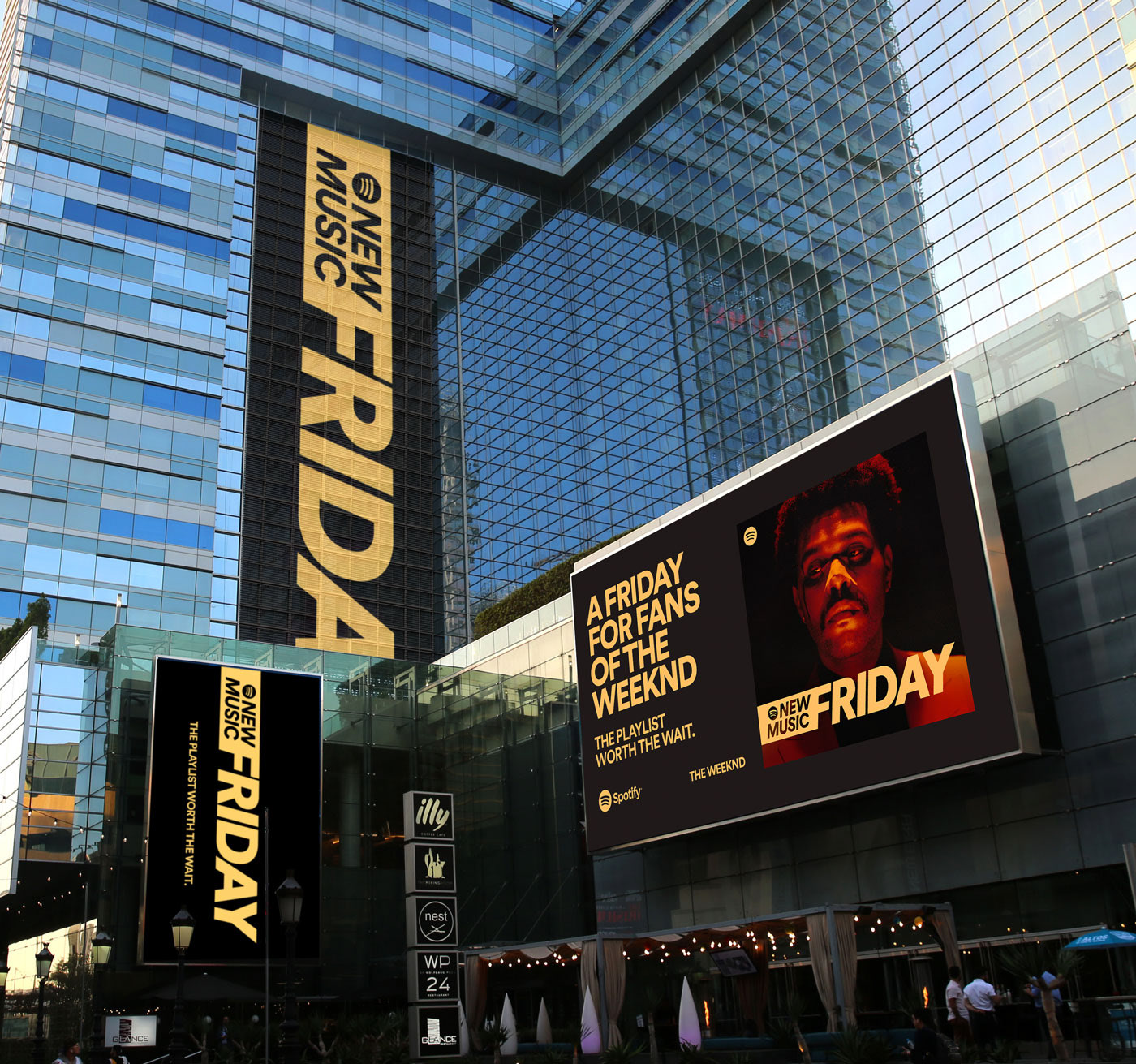
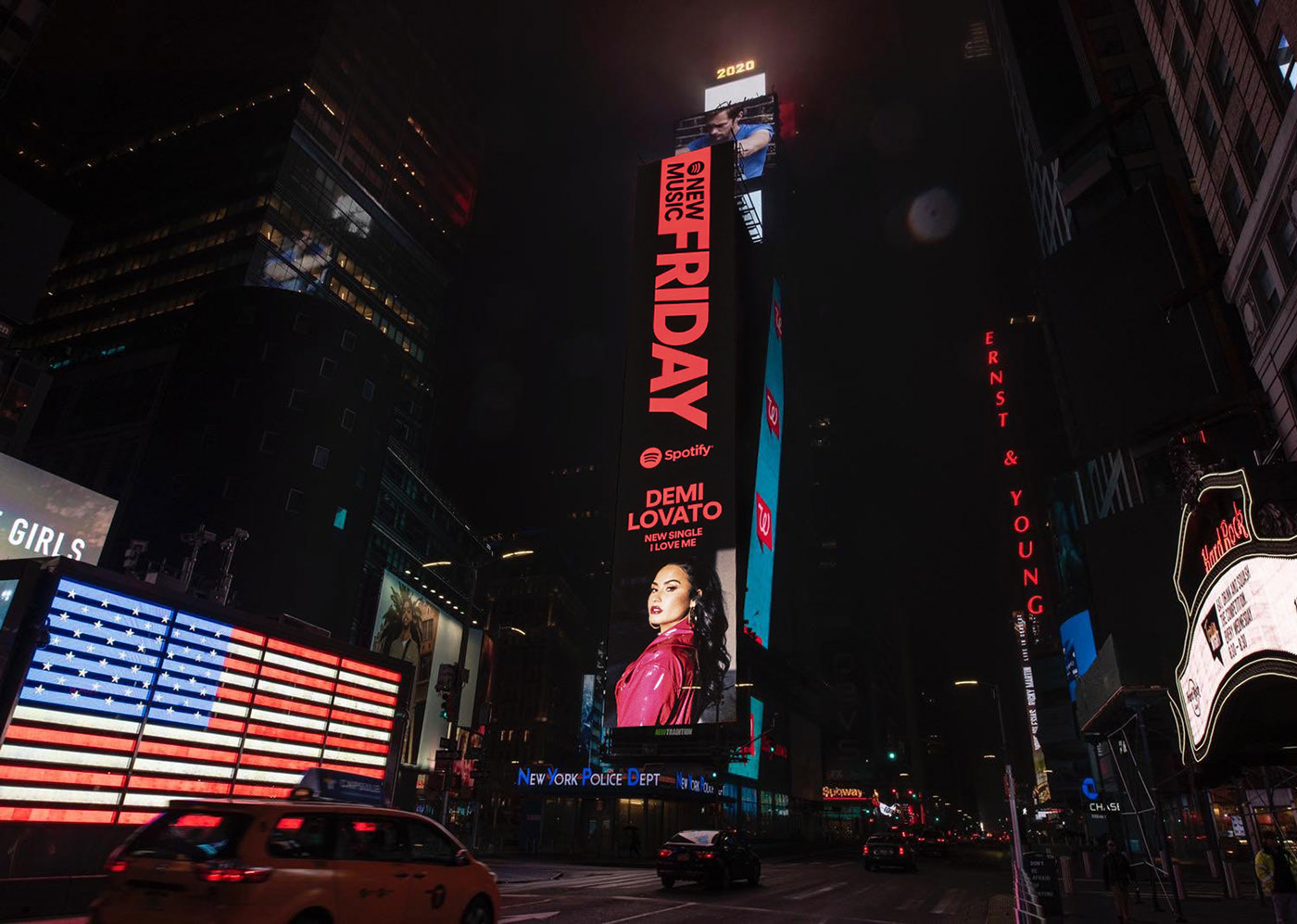
The marketing for New Music Friday truly happens in all channels, so we set off to create layouts that function well in OOH, social, artist-generated social, and on the Spotify platform. The launch campaign included placements around New York City, Los Angeles and Toronto.
Read more on Billboard, Creative Boom, The Brand Identity, Variety, Refinery29 and Forbes.
Credits
Created with Spotify
Executive Creative Director: Alexander Bodman
Creative Director: Cameron Farrelly
Head of Brand Design: Rasmus Wängelin
Brand Design Director: Erik Herrström
Senior Art Director: Angeline Toh
Art Director: Josephine Tansara
Senior Designer: William Oswin
Brand Manager: Aaron Melaragno, Lauren Solomon
Copywriter: Chris Monk
Strategy: Nathan Doiev
Producer: Gabby Kreutter