Riot Games Brand Guidelines Expansion
Design solutions for Riot Brand’s quickly growing visual needs.
The existing Riot Games brand manual had strong visual foundations, but it’s design needs were expanding rapidly. Here were some challenges that were faced and how we pushed the guidelines to accommodate them.
Logomark
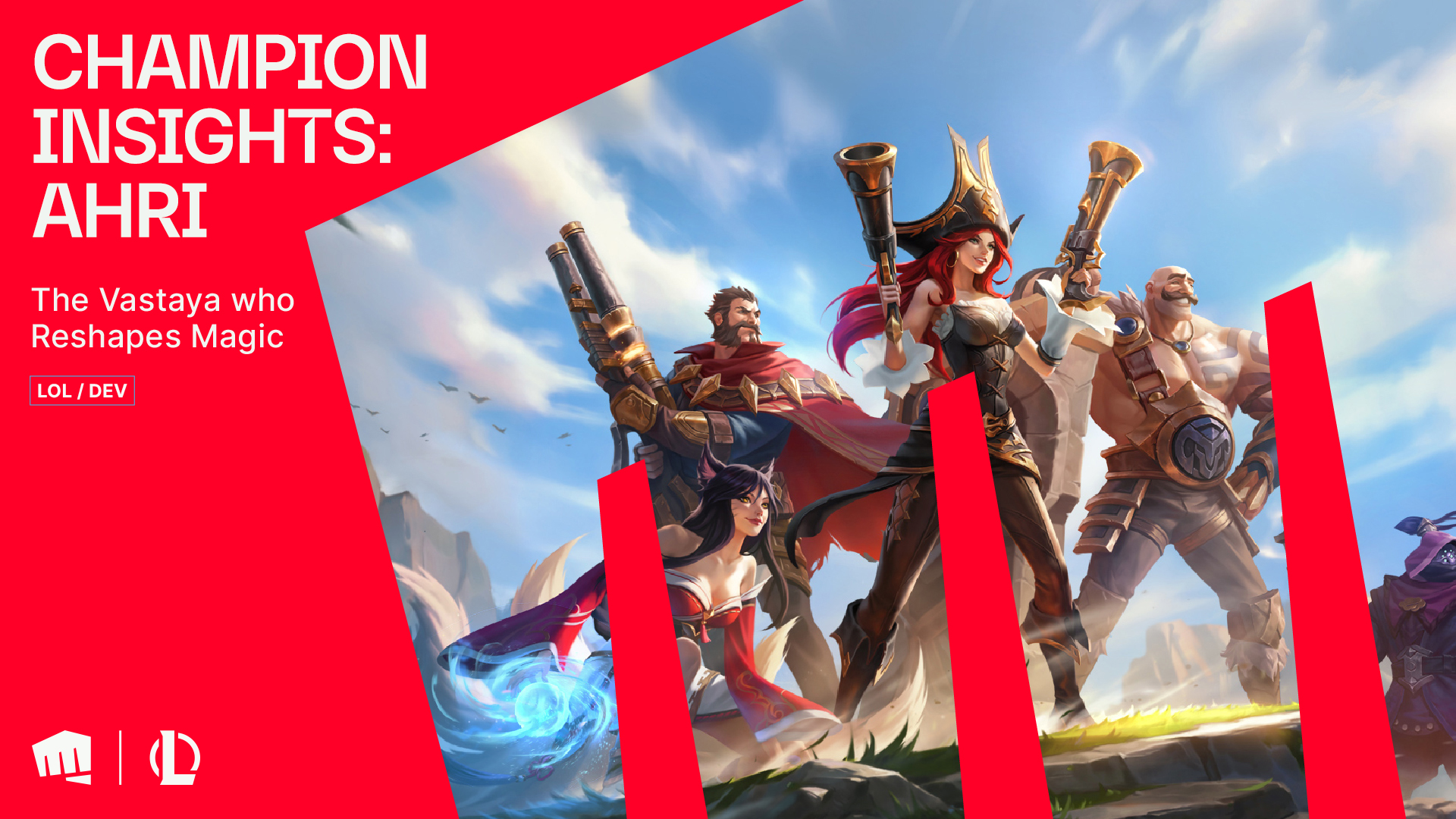
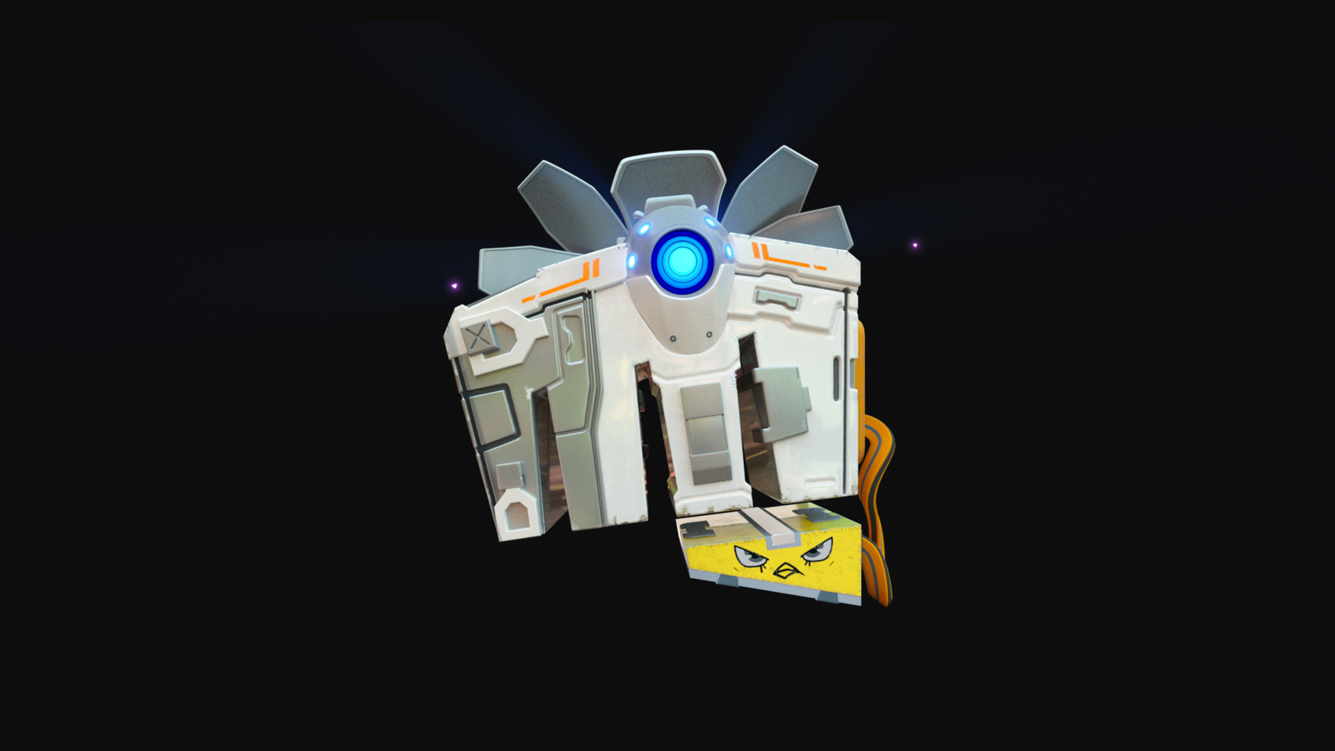
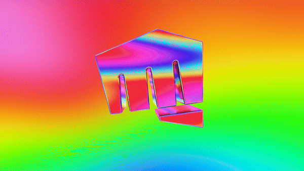
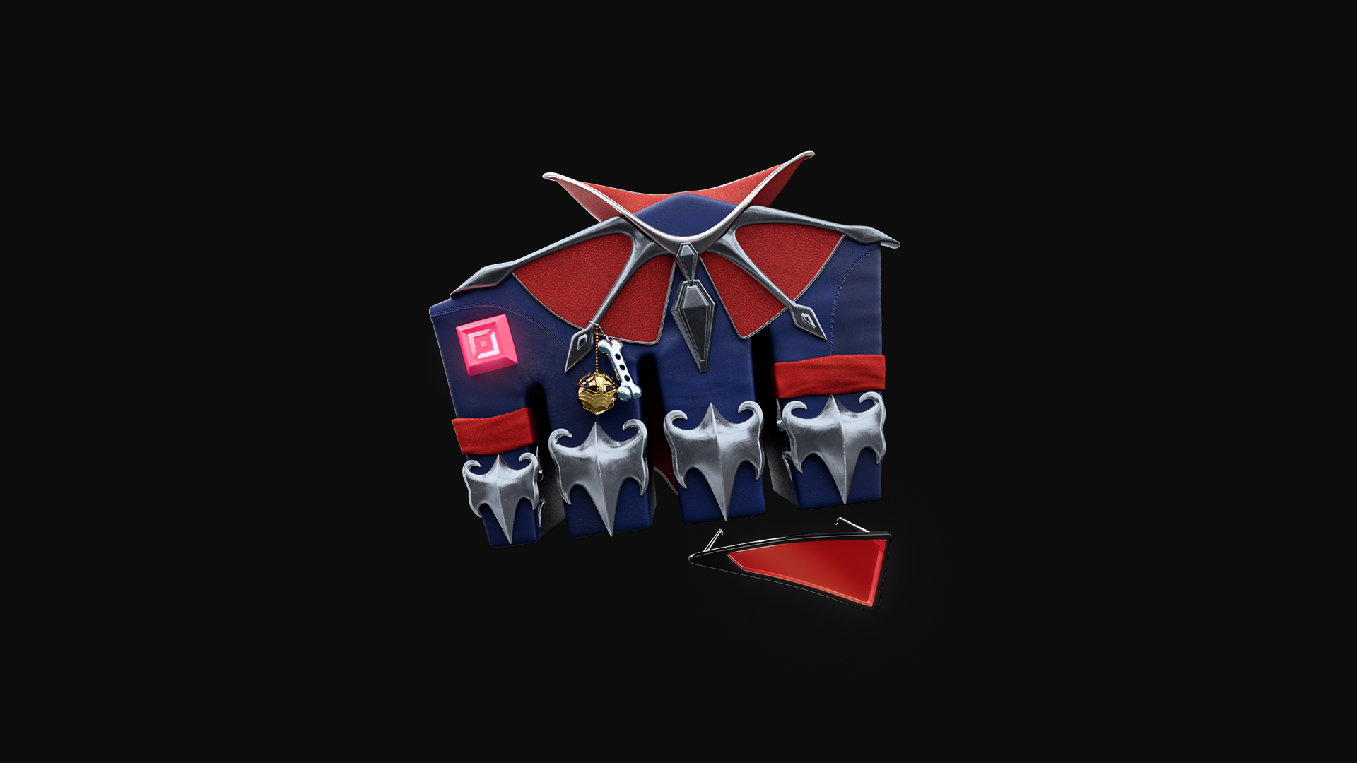
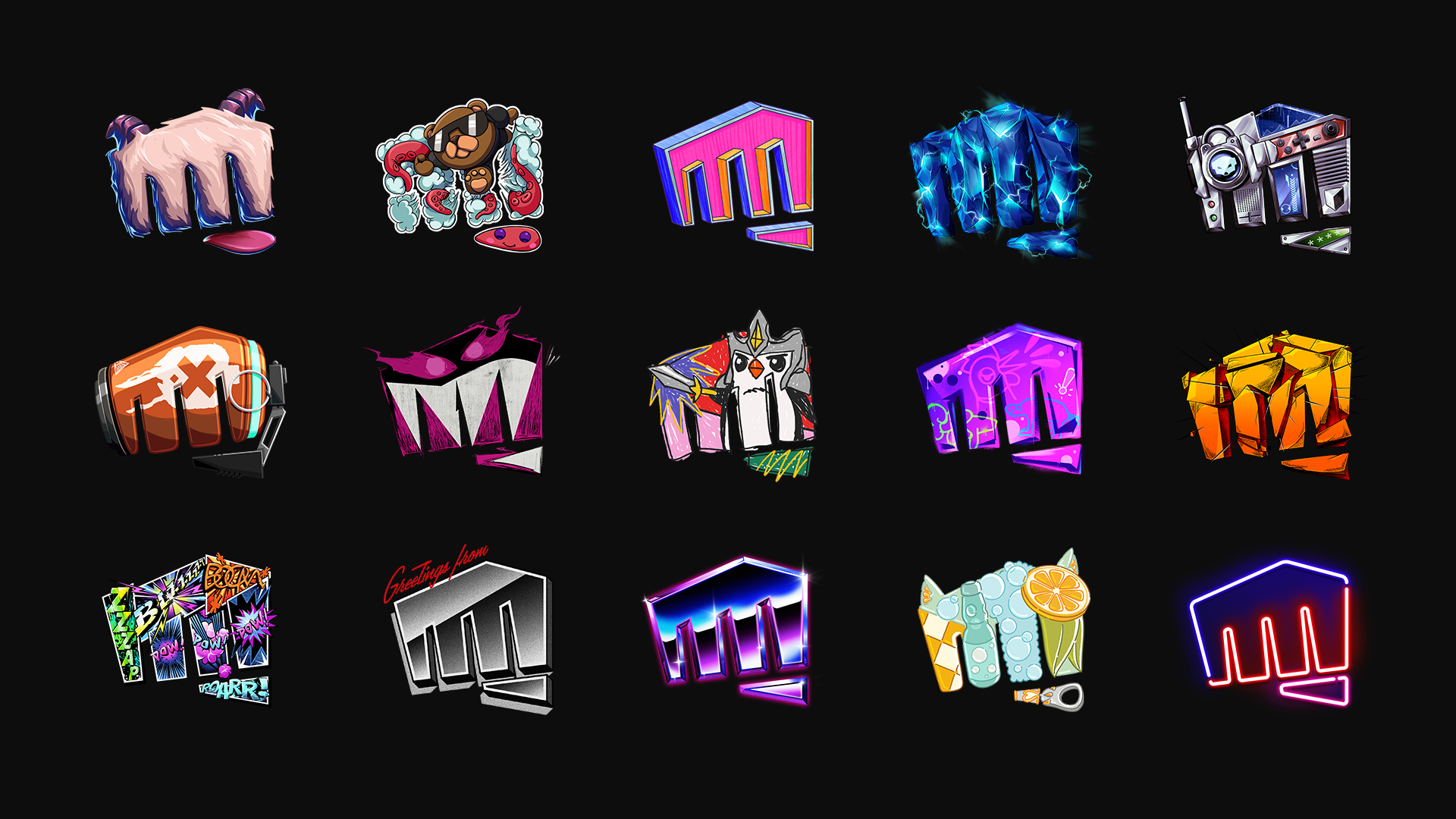
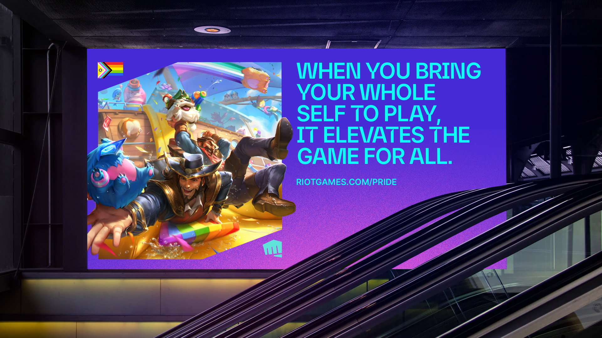
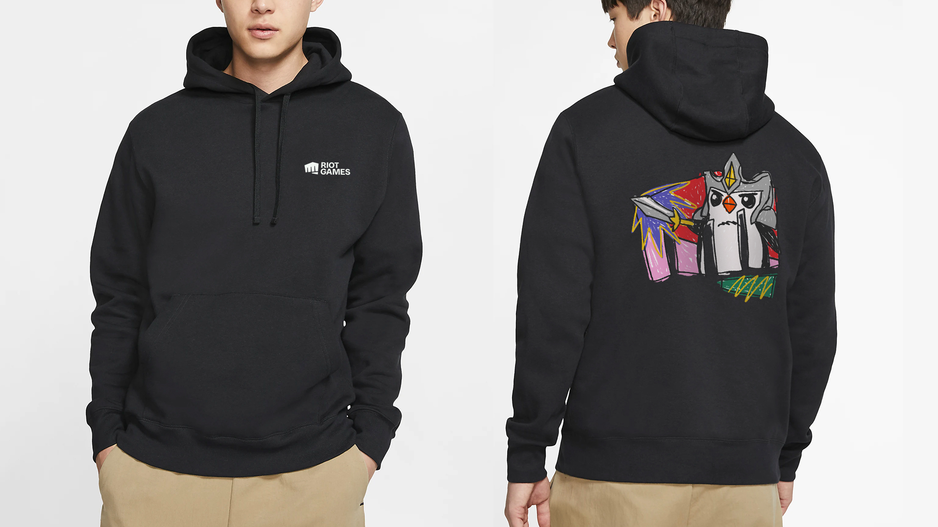
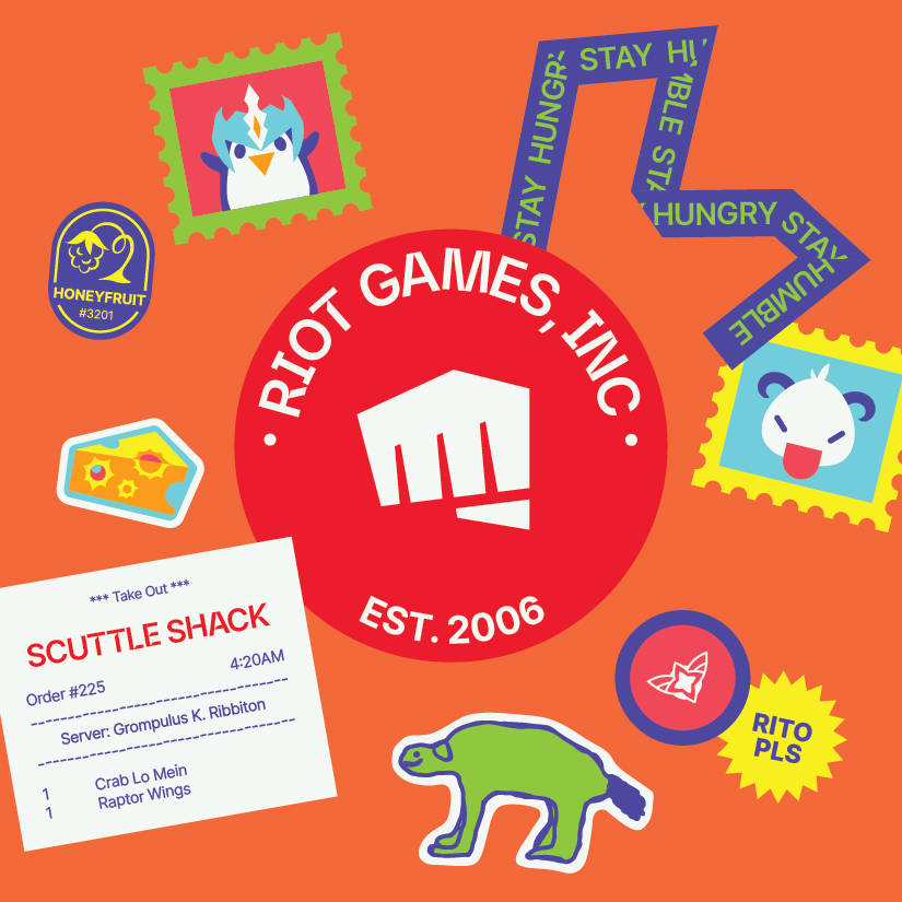
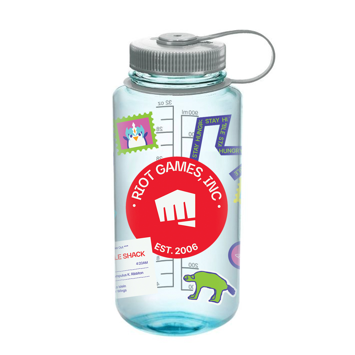
The Fist logomark is the most recognizable element of Riot Brand. For a company that prides itself on it’s creativity and visuals, using our standard logo bumper on every creative output started feeling reptitive and too corporate. We eventually felt the need to expand our library of assets so that we had a larger range of expression. For high visibility campaigns such as the League of Legend’s World’s Championship tournament and Valorant Champions Tour, we created bespoke 3D assets and animated bumpers.
In addition to the 3D assets, we decided to introduce 2D Fist illustrations as a means of creating quicker, but equally effective brand expressions. Our first set included 27 of them. Some had more agnostic art themes, while others were tied into the lore and narrative our games. We also created a set of guidelines to enable other teams to find their own ways to integrate the Fist more seamlessly into their environments.
Cross-game and Partnership Logo Guidelines
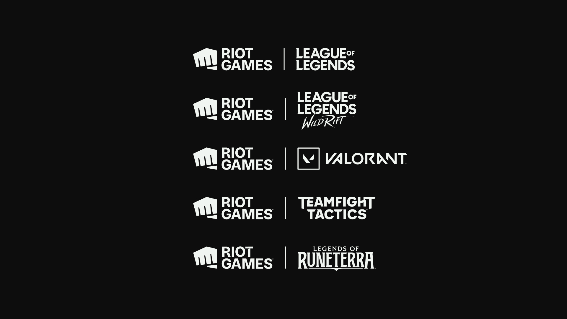
Prior to the creation of the brand guidelines, there had not been much cohesion between the 5 games for displaying different logos together. Each game had it’s own system and there was a need for some structure around how logos would show up along side one another in Riot brand’s communications. Since a large number of our marketing work was partnership campaigns, we had to consider this fact and implement a set of guidelines internally as well as for external partnerships.
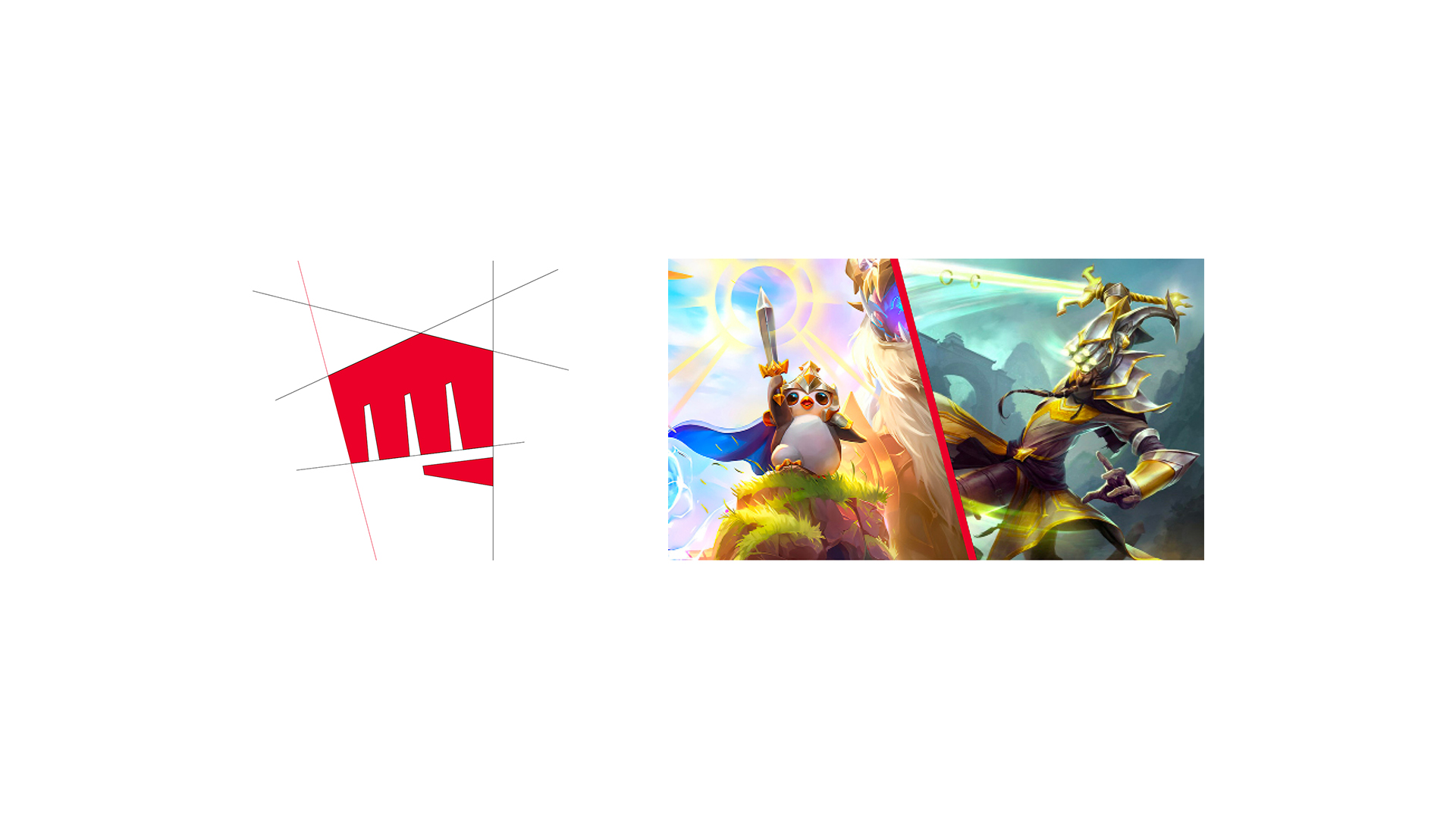
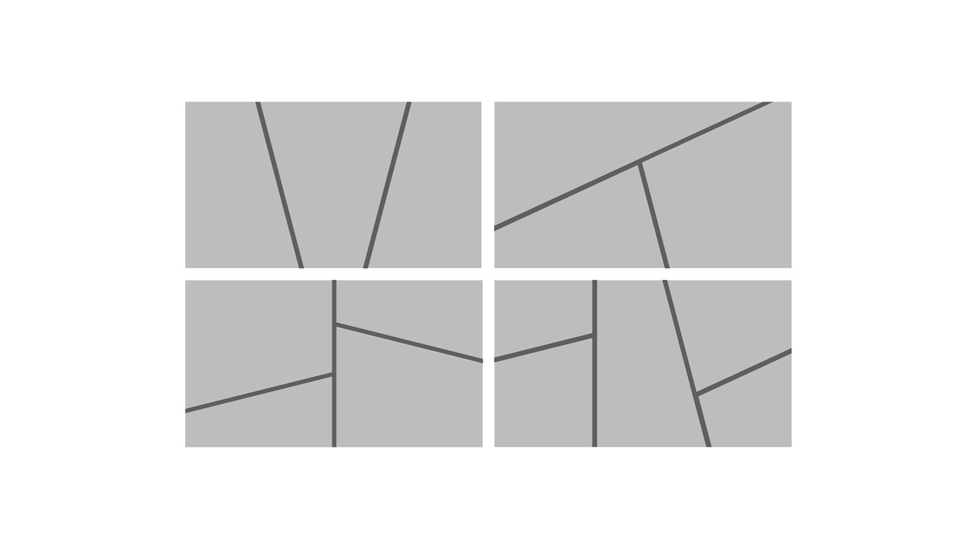
Layouts
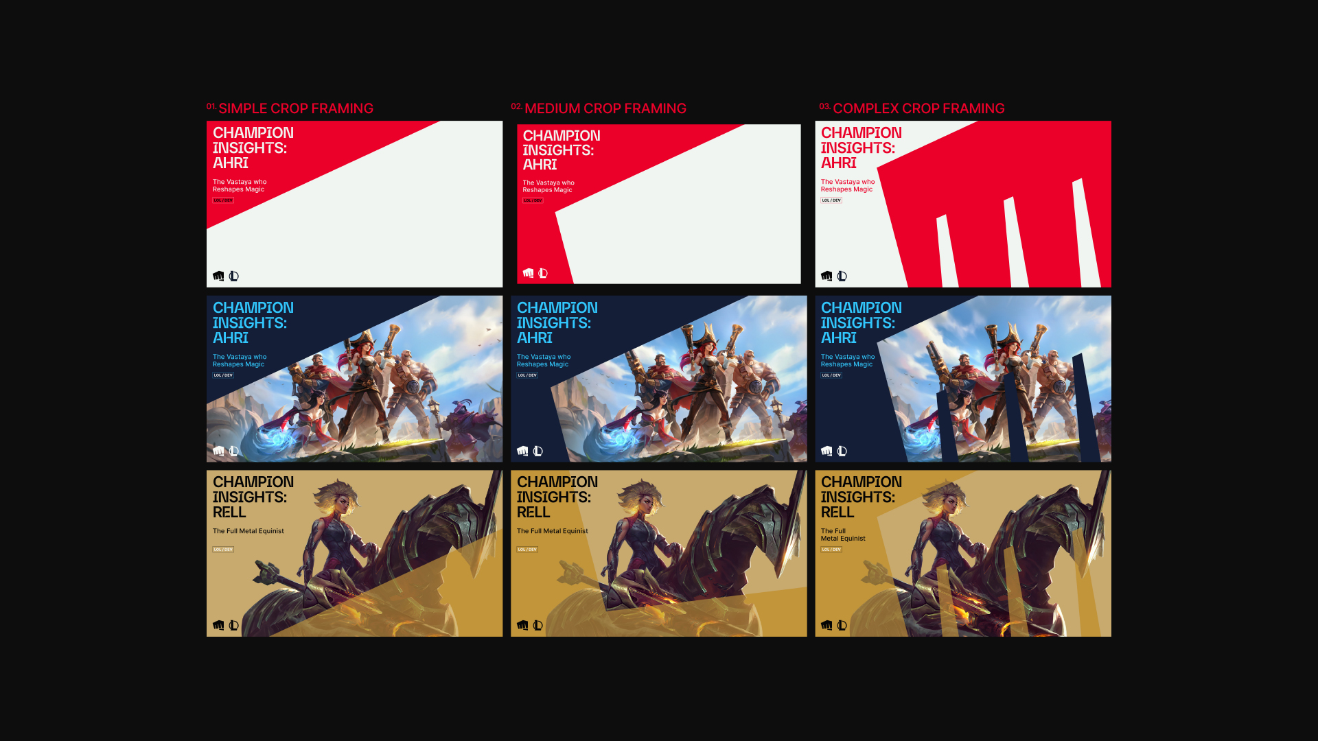
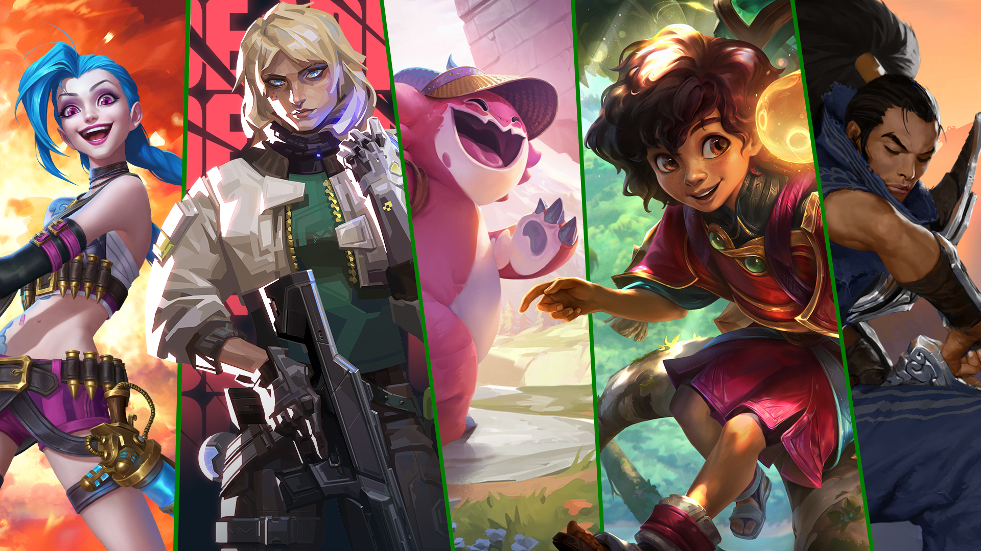
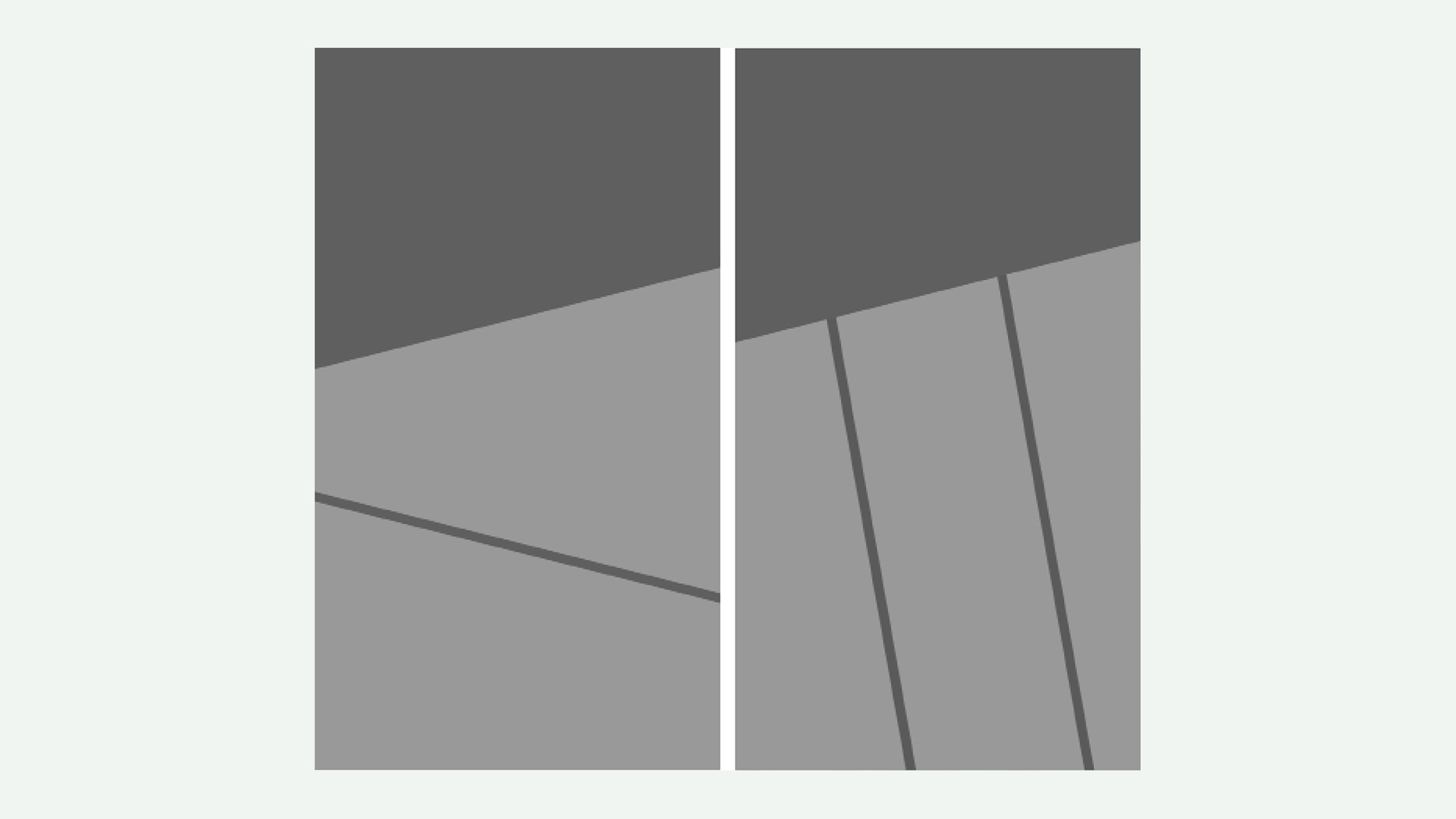
Our existing layouts used a cropping device that’s informed by the shape of the fist. One of the issues we came to face as Riot Brand was finding ways to portray the different games in a single image. Each of our games had a distinct look and feel, but we needed more ways to feature them in the same space while preserving the integrity of each one. By using the angles of the Fist, we created a flexible system for showcasing multiple images.
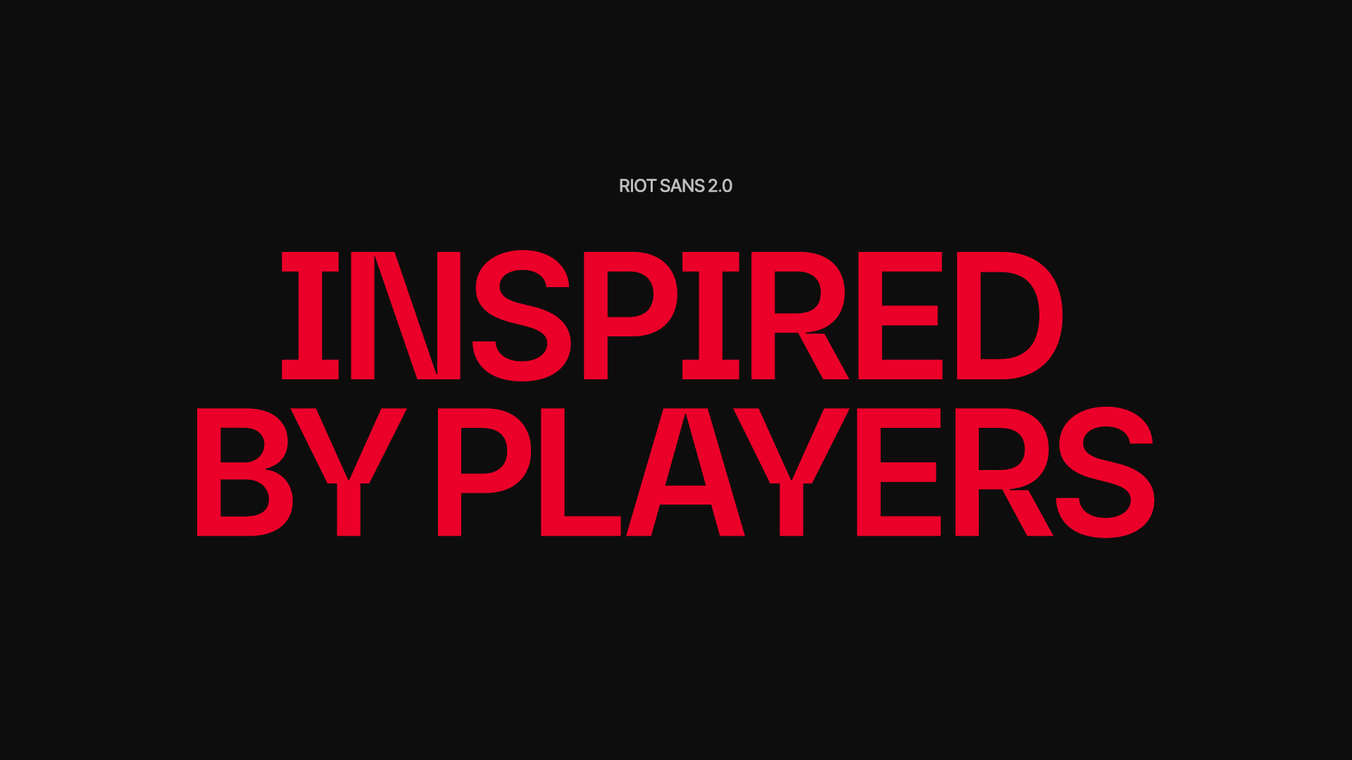
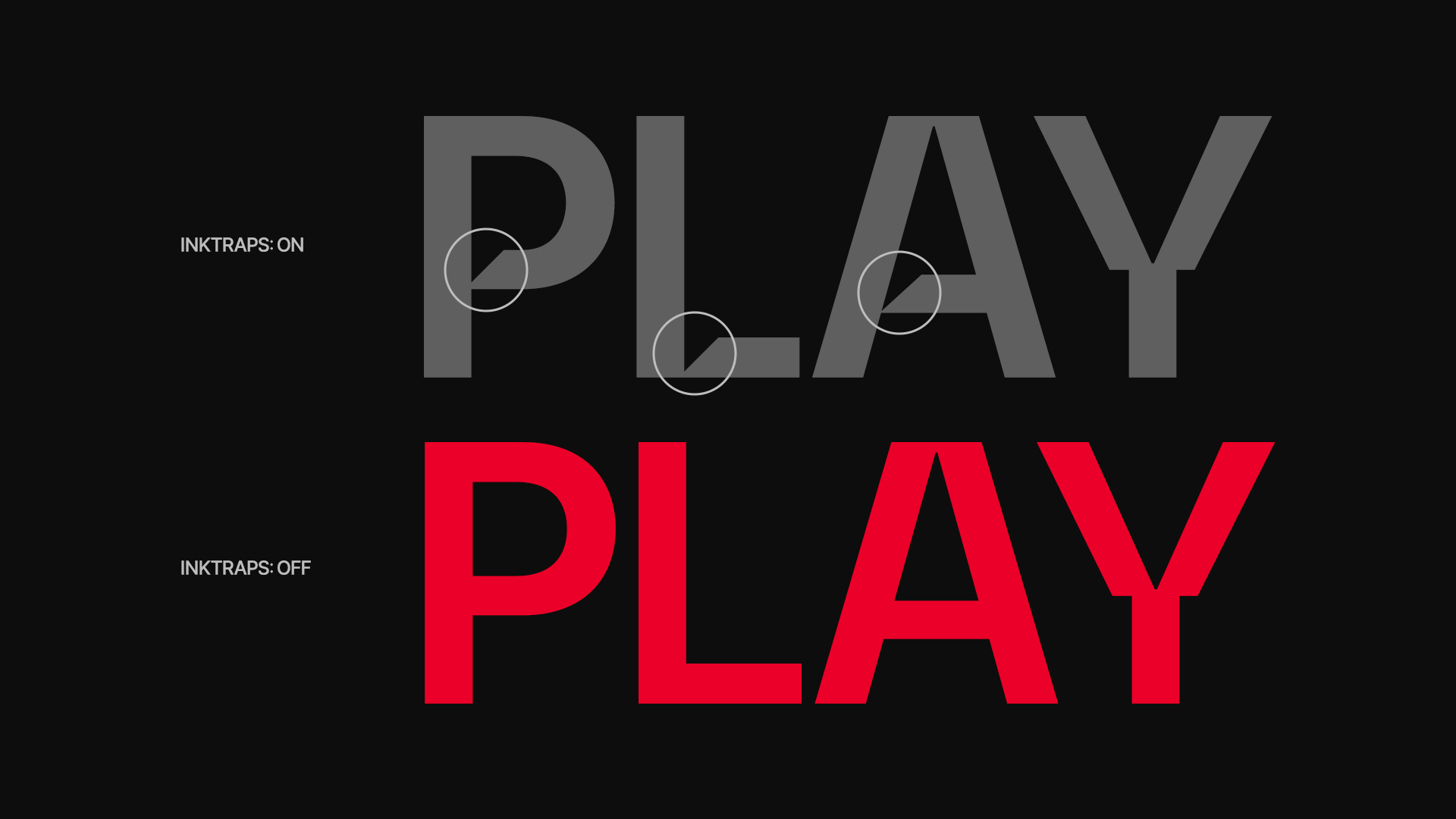
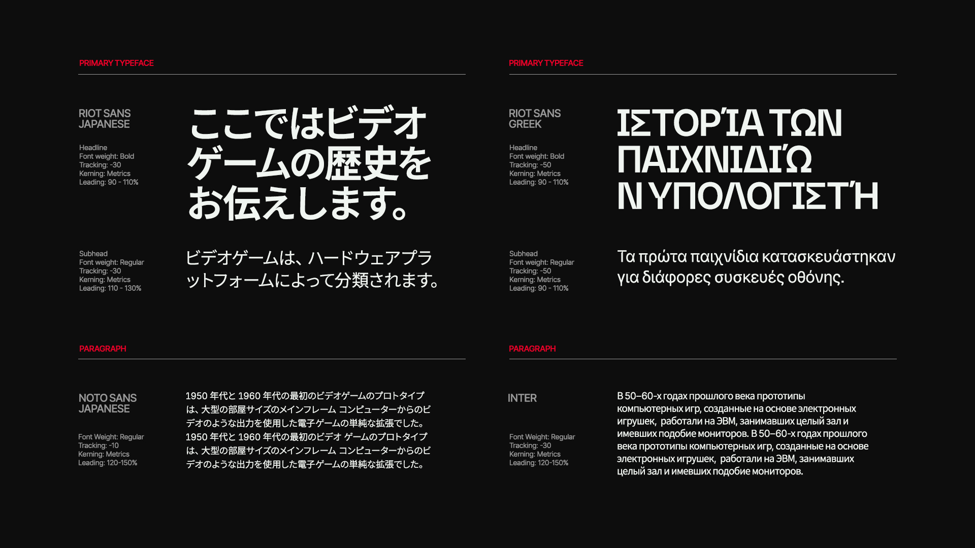
Riot Sans 2.0
The design of Riot Brand’s headline font Riot Sans was also inspired by the angled shapes of the Fist icon. However, after using it for some time, we realized that the ink traps often made it difficult to read and was best used only as display type. We underwent an exercise with Colophon Type Foundry to refine the typeface and introduce an option to turn off the ink traps for better legibility. In addition to the ink traps, we also collaborated with Colophon and Riot’s regional markets to bring the typeface to 10 other languages.
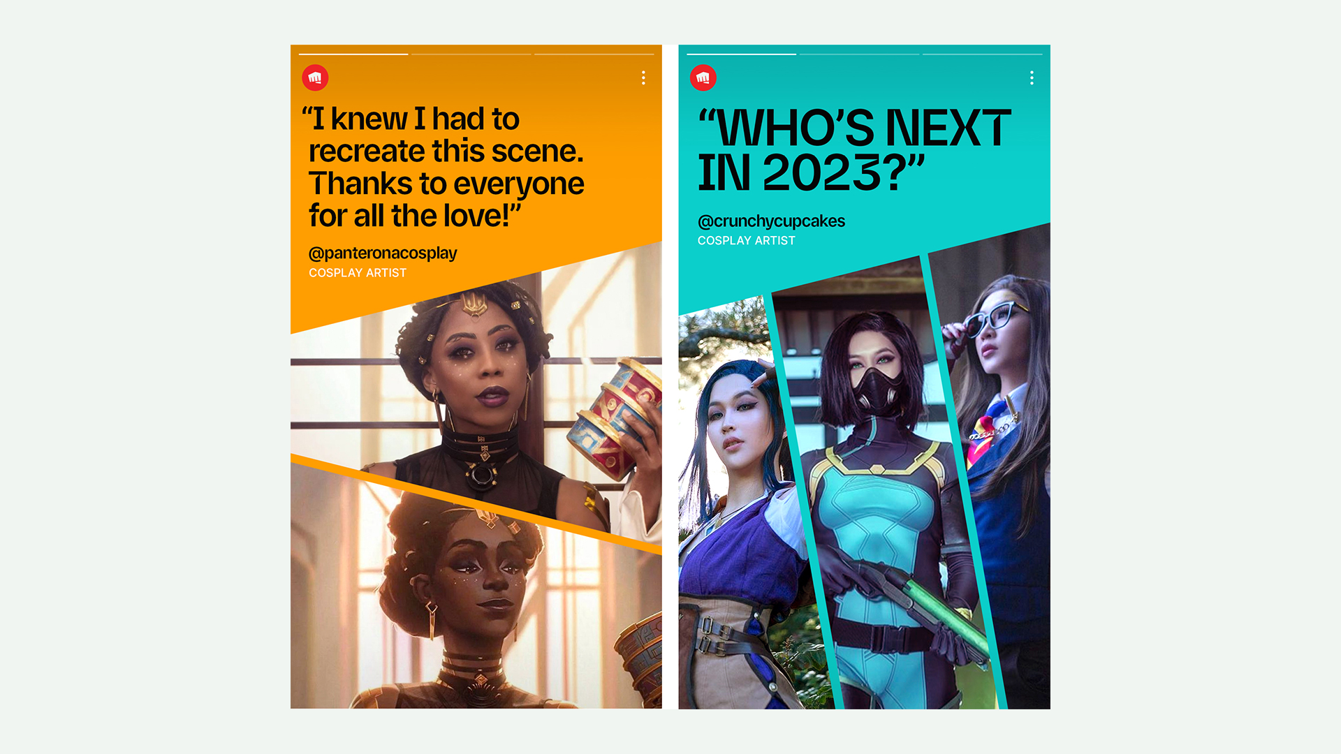
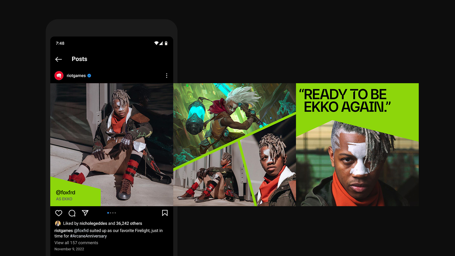
Social Media
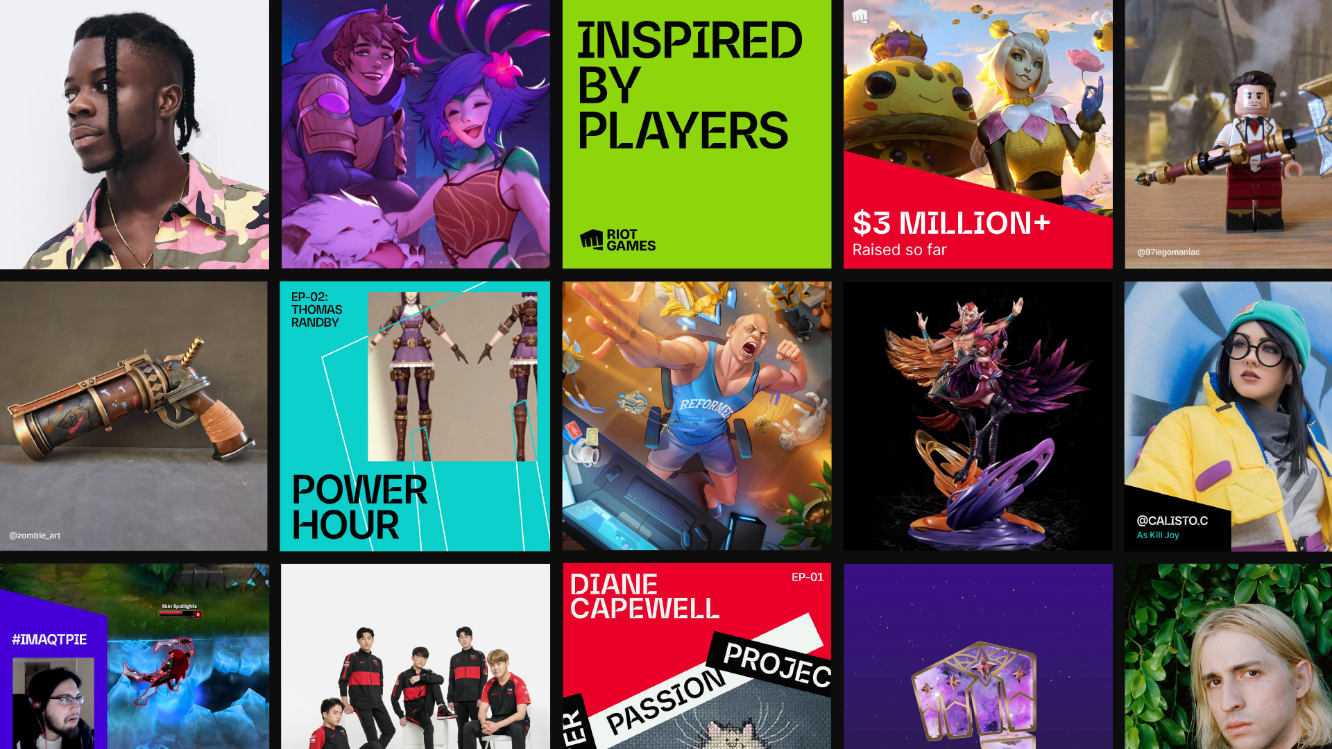
Riot Game’s social channels are one of the main marketing outputs for the brand. It is also where the visual framework gets tested the most as it requires iterations that can accomodate many different types of content. We created a simplified toolkit with templates that could help our creative partners find solutions to quick social activations.
The existing Riot Games brand manual had strong visual foundations, but it’s design needs were expanding rapidly. Here were some challenges that were faced and how we pushed the guidelines to accommodate them.
Logomark
The Fist logomark is the most recognizable element of Riot Brand. For a company that prides itself on it’s creativity and visuals, using our standard logo bumper on every creative output started feeling reptitive and too corporate. We eventually felt the need to expand our library of assets so that we had a larger range of expression. For high visibility campaigns such as the League of Legend’s World’s Championship tournament and Valorant Champions Tour, we created bespoke 3D assets and animated bumpers.
In addition to the 3D assets, we decided to introduce 2D Fist illustrations as a means of creating quicker, but equally effective brand expressions. Our first set included 27 of them. Some had more agnostic art themes, while others were tied into the lore and narrative our games. We also created a set of guidelines to enable other teams to find their own ways to integrate the Fist more seamlessly into their environments.
Cross-game and Partnership Logo Guidelines
Prior to the creation of the brand guidelines, there had not been much cohesion between the 5 games for displaying different logos together. Each game had it’s own system and there was a need for some structure around how logos would show up along side one another in Riot brand’s communications. Since a large number of our marketing work was partnership campaigns, we had to consider this fact and implement a set of guidelines internally as well as for external partnerships.
Layouts
Our existing layouts used a cropping device that’s informed by the shape of the fist. One of the issues we came to face as Riot Brand was finding ways to portray the different games in a single image. Each of our games had a distinct look and feel, but we needed more ways to feature them in the same space while preserving the integrity of each one. By using the angles of the Fist, we created a flexible system for showcasing multiple images.
Riot Sans 2.0
The design of Riot Brand’s headline font Riot Sans was also inspired by the angled shapes of the Fist icon. However, after using it for some time, we realized that the ink traps often made it difficult to read and was best used only as display type. We underwent an exercise with Colophon Type Foundry to refine the typeface and introduce an option to turn off the ink traps for better legibility. In addition to the ink traps, we also collaborated with Colophon and Riot’s regional markets to bring the typeface to 10 other languages.
Social Media
Riot Game’s social channels are one of the main marketing outputs for the brand. It is also where the visual framework gets tested the most as it requires iterations that can accomodate many different types of content. We created a simplified toolkit with templates that could help our creative partners find solutions to quick social activations.
Credits
Created with Riot Games
Brand Director: John Furnari
Creative Director: Nichole Geddes
Design Director: Long Vu, Ross Kurtis
Senior Visual Designer: Angeline Toh
Brand Manager: Chris Hoag, David Jones
Producers: Lisa Bass, Julie Morrandez
Collaborators: Colophon Foundry, I Love Dust
Original Brand Toolkit created in collaboration with Mother & I Love Dust.